With Mobile First, developers have the flexibility to scale up rather than scale down. For example, when you start designing for a desktop platform, there is a lot more real estate to take advantage of. The core design elements may be incredible on a desktop platform, providing a really great user experience. However, when this design needs to be adapted for mobile, you realize that none of the technology that makes the desktop user experience so great can scale down well to mobile devices. Which then leads to a sub-par mobile experience in comparison to the desktop version, and for some consumers it may feel like more of an afterthought than an actual finished product.
Scaling up designs on the other hand, presents a lot more freedom in the way you’re able to adapt your designs. With a well-functioning mobile product, you’ve already prioritized features and capabilities and identified the essential elements of your platform. Progressively enhancing the mobile platform to fit the requirements for desktop becomes a series of decisions on how to add rather than cut elements of your platform, which gives you another opportunity to be creative about how to engage users.
Why Does Mobile Matter?
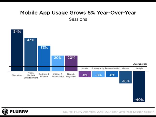
Whether it’s browsing the internet on the train in the morning, checking your emails while waiting for an appointment, or listening to music at the gym, cell phones are deeply embedded in our daily routines. Each speck of downtime is one we can use to update ourselves with our network and the news, or even order that one thing from Amazon that we keep forgetting to buy. It’s no surprise that our mobile devices take up almost 5 hours of our day, mainly attributed to application use. Mobile application usage grew 6% last year, with interesting shifts in how people are using the time spent on their phones.

Image Credit: Flurry Analytics
Over the last year, people have shifted from spending time occupying themselves with applications for games, sports, lifestyle, personalization, and photography to applications for shopping, entertainment, news, business, and productivity. We’ve invested in mobile applications to help us carry out the responsible, daily tasks we manage like ordering groceries, reading the daily news, checking on the stock market, and listening to music.
What Does This Mean?
We use mobile devices to help us live our lives more efficiently. Rather than acting as more of an ‘escape’ or ‘exploratory’ outlet, we’re increasingly relying on mobile apps and devices for integral parts of our lives. This increasing reliance on mobile apps and devices in time will affect our perception and expectation of the experience these apps should and will deliver. Our increased dependence on mobile apps and devices for e-commerce, news sources, finance, and entertainment mirrors the trend sweeping the SDLC since Google first announced its approach in 2010- Mobile First.
How Instagram Mastered Mobile First
Instagram – what we first knew as a mobile app to add filters to images and share photos with friends has now become a billion-dollar business and one of the primary social networks today. With over 375 million users, Instagram continues to push the envelope with features and functionalities that transform mobile experience. But let’s not forget, Instagram was (and continues to be) engineered as a mobile app first and foremost.
In 2010, Instagram was released by cofounders Kevin Systrom and Mike Krieger as a free mobile app, with a few filters and the ability to upload your square photo into what was for most of us back then considered a virtual abyss. Fast-forward eight years, and now you can upload full size images, videos, and ‘stories’ as well as edit these files with a plethora of filters, geofilters, geotags, hashtags, emojis, and more. In addition to these enhancements, Instagram has built an application that fosters community, collaboration, and sharing, through functionalities like the explore feature, bookmarking, location searches, and direct messages.
But how did they get there?
When Facebook acquired Instagram, which at the time retained 30 million users, Instagram only had six engineers. They embodied the phrase "Do the simple thing first" and kept a clear goal of mastering the mobile application. Each design was meant to enhance the mobile user experience and take advantage of all the possibilities mobile had to offer. With a lean team, Instagram prioritized making changes that were simple, at first by necessity. In their early days, Instagram had a team of two, so prioritization was the name of the game. Create a simplistic design that gets the job done and is easy to use. Even as the user interface and the capabilities have evolved over the years, the core mentality has remained the same - focus on simplicity.

Image Credit: Prototypr
Truly, Instagram was designed to take advantage of all that mobile platforms have to offer. A simple, straightforward interface allows users to take a variety of actions, some of which can be complex, in a very intuitive manner. Instagram’s evolution and success as primarily a mobile app serves as a testament to mobile-first design. While Instagram’s priority is, and remains, mobile first, it’s desktop version offers the same sleek design, encouraging users to switch back and forth from mobile devices to their desktop.
In fact, when asked about their engineering processes today, Krieger explained “I love that our engineers are first and foremost Instagram users.” One of the app’s most productive overhauls came when the team filled a whiteboard with common actions, such as fetching a photo from the server–and then resolved to cut the time that each activity took by 50%. “In a month, we pretty much reduced the latency by half,” he remembers. “That’s a noticeable improvement for users.”
With a clear process, Instagram makes it easy for users to upload, share, and peruse posts all from their mobile app. The process feels uninhibited by the mobile form factor, in fact it actually thrives in it. So while mobile first may seem a bit daunting, or even quite backwards, the importance of understanding the value it can provide is essential to any modern business.
Mobile-First & the Software Development Lifecycle
If you opt to take a mobile-first approach, understanding whether you’re going to move to a full-fledged desktop platform in the future can be key in planning and executing design plans. Depending on what your workflow and goals are, you may layer the desktop design in with the application design, once you’ve finalized developing and testing the app version.

If you’re a DevOps organization, we don’t need to remind you of the importance of monitoring earlier and often. However, if you are not currently a DevOps enabled organization, and you’re looking to take a mobile-first approach to designing and developing your applications, monitoring earlier can help you streamline the deployment process for both the mobile and desktop variants of your platform.
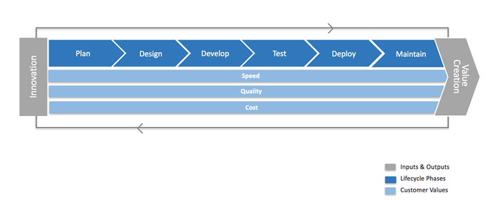
In that case, phases of a Mobile First Design can look something like this:
- Planning & Vision Crafting – Research and plan your app’s functionality, design, and purpose. In this phase you combine, organize, and structure a plan for what problem the app will solve, who the target will be, and what capabilities are the core functionalities. Detailing a scope of work, prototype, vision board, etc. can help ensure that your idea is digestible and helps ensure you can map out a timeline. This phase lays the groundwork for the following steps, and if you have a clear vision for the app, you may even start to draft preliminary plans for the desktop version.
- Technical Assessment – Analyze the systems you want your application to rely on. How will it source data? Will you rely on APIs- public or private? What platform(s) will you build your application for? Getting a solid understanding of the systematic elements that will form the foundation for your application to live on is vital in this stage.
- Design and Prototype – Transform what may be a set of ideas on paper into visualized, tangible representations of what you want your application to look like, to feel like, and to accomplish. User experience is essential here. Designing with mobility in mind- determine what flows will be intuitive and easy for mobile users.
- Development – Here’s where you can breathe life into your design. The coding for the app begins here!
- Test – This is where our model may be a bit unconventional for some organizations. During the test phase, you may opt to automate tests, manually test, release a beta, or even host a user group to get feedback and fresh eyes on your application. What we suggest is to start monitoring the application here. Monitoring in pre-production environments offer a variety of benefits including:
- Insights to your applications performance over time (rather than at one point in time)
- Understanding of the viability of the key user journeys (not necessarily what the test scripts are testing for)
- Prime your test environments by driving steady traffic to what would be ‘cold’ environments
- Understanding the state of your test environment itself
By monitoring in your pre-production environments, you set yourself up for success in your releases. Complimentary to your testing methods, monitoring offers a constant view into application health, and provides feedback so you can iteratively improve. Now, for your desktop version if you opt to create a desktop version – the design can start here. Once you know how your application performs, what doesn’t work, and you’ve solidified what functionalities you rely on, these designs can be leveraged as a starting point for the desktop platform.
- Deploy – Now that you’ve tested (and hopefully monitored) the success of your application, it’s ready to be released into the wild.
- Monitor – Now to stay on top of the game and continuously delight users, you have to verify that your application and/or desktop version are delivering the design you envisioned. Monitoring provides insight about performance, availability, and functional correctness.
How Can You Improve Mobile Application Stability and Performance?
Continuous innovation. Testing and monitoring more often can provide invaluable feedback on how to improve your applications or websites. Keeping a sharp eye on the performance and functionality of your application with monitoring tools like AlertSite, offer a starting point, with data that illuminates areas that need improvement in your application.
AlertSite can help you reinvigorate your monitoring strategy.
Additional Resources