Understanding how to improve your application performance is essential, but are you actually comparing the right load testing data to iteratively improve?
Performance testing is all about understanding how your application behaves under conditions of duress. But as you load test regularly and make efforts to work on various issues uncovered during these tests, it’s also important to understand just how your application’s performance has evolved over time.
This is especially useful if your team is constantly releasing new features and updates to your web application. Analyzing if the response time and the error counts end users experience has improved or degraded over time with new features, enhancements and fixes is just as important as one-off load test analysis.
Which is why we’re super excited for LoadNinja’s new test run comparison feature. The comparison allows you to quickly see how your application’s performance has evolved over time, and catch any abnormal trends in performance that may affect end user experience.
How Can You Compare Load Test Results?
To compare reports in LoadNinja, our SaaS Load Testing tool, all you need is to have is more than one test run. To have a more direct apples-to-apples comparison, always compare runs from the same scenario.
Open a project which contains multiple runs, check the runs you want to analyze and compare side-by-side, and click the highlighted Compare button. You can compare up to 4 test runs together.
Reporting & Comparing Load Test Runs
Analyzing a static run report can be helpful, but real actionable insights often come from comparing and analyzing multiple runs, and multiple components within each run, so that you can begin to iteratively make improvements in your application performance. In LoadNinja, the test comparison report can be divided into 4 different tabs, so you can delve further into the data you have. These 4 tabs include:
1. Summary: This tab shows script-level comparisons across different metrics like average response time and successful iterations. It only details the scenario configuration across each run so you can have clarity on the different parameters that went into every test.
2. Charts: This tab allows you to visualize each run across different KPIs like total response times, DOM load times and error counts. You can add as many charts plotting various KPIs across different steps and scripts on each run.
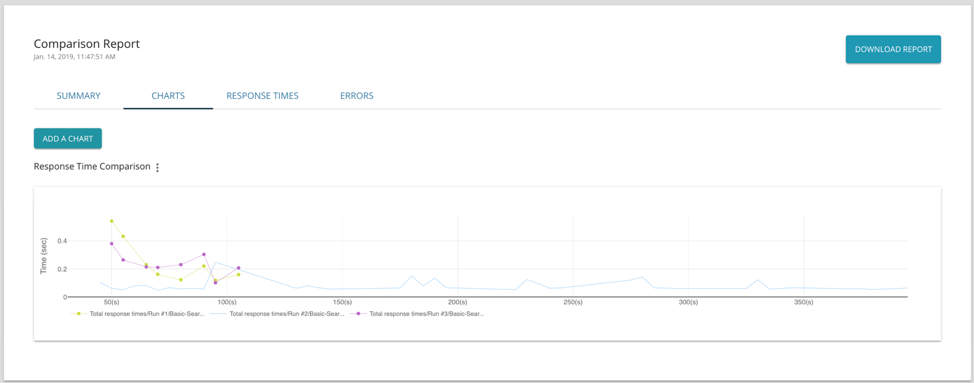
Since LoadNinja uses real browsers at scale, you can get a breakdown of navigational performance timings that give you a granular and holistic view of the various components of the response times experienced by your end users,
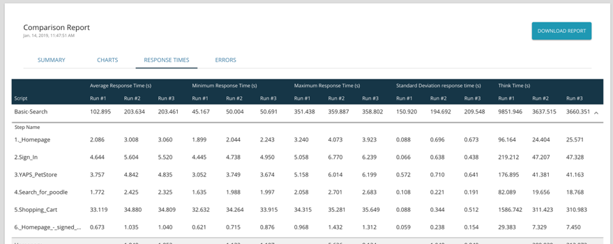
3. Response Time: This shows users granular time-based statistics for different metrics across scripts and steps for different runs. Some of these metrics include standard deviation of response times, maximum response times, connect time and think times.
4. Errors: This allows users to compare if the number of errors have improved, stayed the same or increased across the different runs.
Widening the scope of comparison, with the ability to understand which components are performing as expected over time or are not performing well, is absolutely critical for teams looking to improve performance. It's no surprise that data-driven improvements tend to yield the best results, so we've made it easier for teams to make their data actionable, and to share this path of improvement with their relative stakeholders. These reports can be downloaded as a PDF for additional team visibility if necessary.
You can always check out the documentation on this feature we well to know more.
Let us know what you think of the result comparison by emailing us directly at [email protected]