One of the challenging parts of designing a responsive site is truly visualizing what your website will look like across platforms. Most of us develop or design on only one or two machines. If you’re like me, a new machine as a daily driver is a pretty big interruption in life and I try to minimize that as much as possible. That’s why our Screenshot Comparison tool is so powerful. Your users are on their main computers too, and their experience is actually more important than yours!
When you run an automated screenshot, you’ll be given the chance to select a baseline browser. We’ll run each screenshot against your baseline browser and show you how many elements are hidden or misplaced. This can help increase your test coverage and speed up actual debugging time. Spending valuable time manually testing each configuration is simply too resource-heavy for most organizations. Teams can get to the browsers and configurations that matter with automated screenshots.
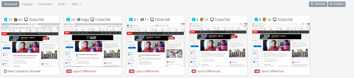
Once you have your screenshots loaded, click Compare in the upper right-hand corner, and select one of the configurations to run. With the comparison tool, you can easily see how other browsers and devices effect your site’s design against a baseline browser like your main development setup. You can select real devices to truly understand how your website, that you develop all day on your desktop, looks on an actual Samsung Galaxy S7.
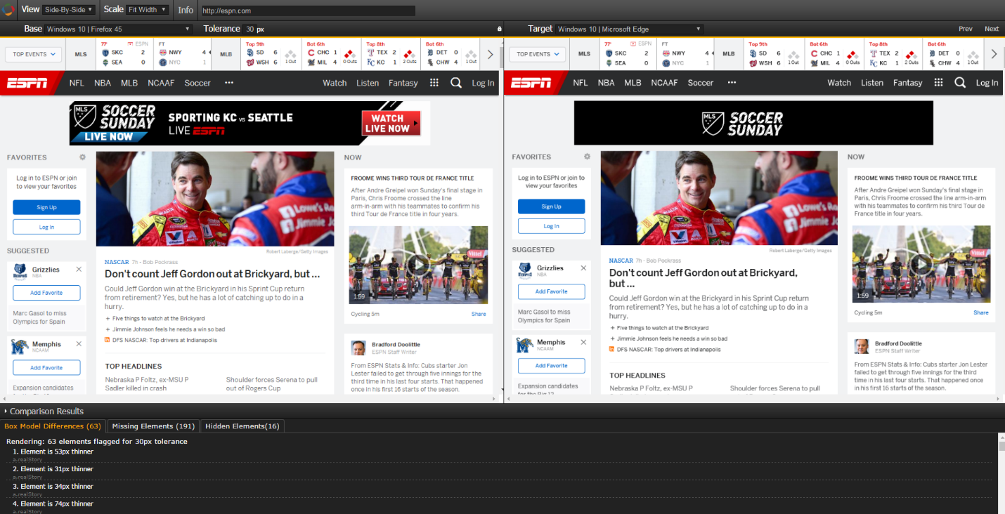
The comparison engine also crunches up all of your vector points and lets you know what elements may be off. You set the tolerance, and we’ll identify how far off elements are compared to your baseline browser. It will also identify missing or hidden elements based off a browser's and a device's resolution.
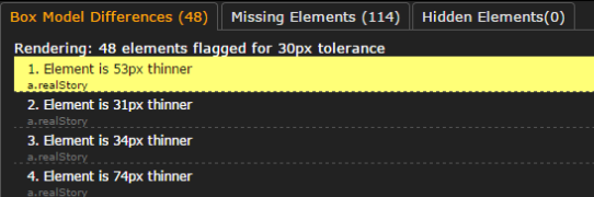
The differences are highlighted when selected like such:
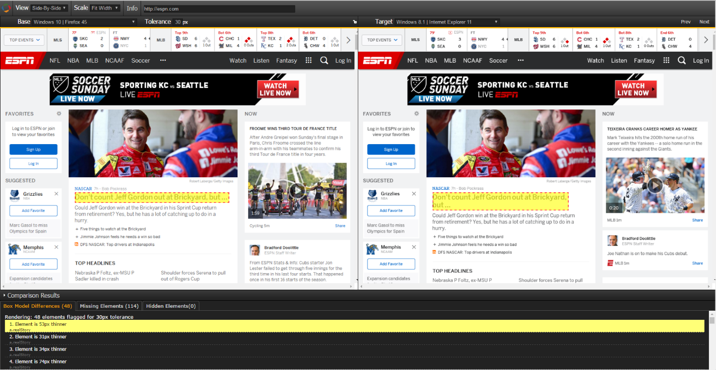
This makes it easy to see when certain lines will break in text, images pushed around advertisements and more. Have you ever thought about how your ad looks like in Internet Explorer? Or how your download button looks on an iPhone. It’s alright if you haven’t, but in today’s mobile lifestyle- this can be the reason for hitting your revenue goals or missing them.